Nils Roth · 7 October 2026
Inside the Evolution of Project Visualization Tools Beyond Basic Kanban Implementations
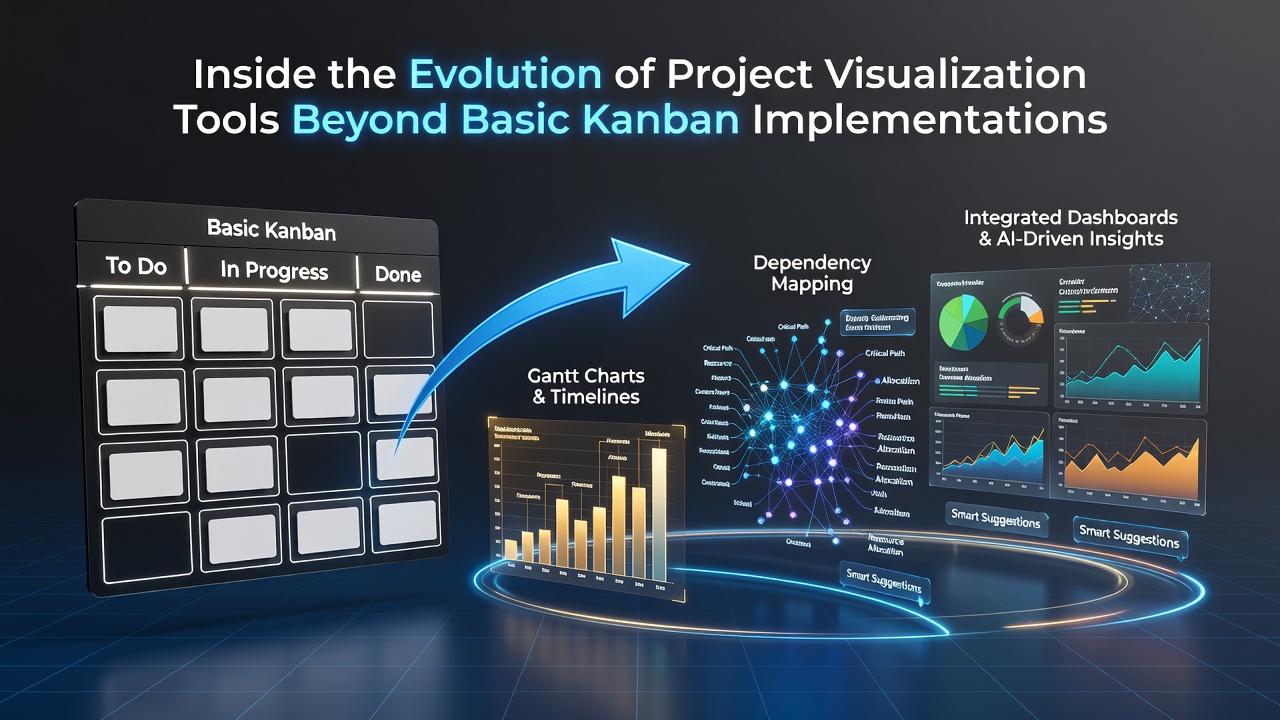
Project visualization tools began with physical boards that teams used to track workflow stages through simple cards and columns, and this approach drew directly from manufacturing practices developed in the mid-20th century at Toyota; researchers later documented how those methods migrated into software development during the early 2000s when digital platforms first replicated the same structure on screens.
Basic Kanban implementations focused on limiting work in progress and visualizing task movement, yet organizations soon required more layers of information such as deadlines, dependencies, and resource allocation that single-board views could not accommodate without becoming cluttered.
Early Limitations and the Push Toward Integration
Teams noticed that static columns failed to represent time-based relationships or overlapping workstreams, so developers responded by embedding Gantt-style timelines alongside Kanban columns in the same interface; data from industry surveys conducted through 2023 showed that projects incorporating these combined views reduced missed milestones by measurable margins compared with pure board systems alone.
One study released by the Project Management Institute highlighted how mid-sized enterprises adopted hybrid layouts that merged status tracking with dependency mapping, allowing managers to adjust priorities while seeing ripple effects across connected tasks in real time.
Expansion Into Multi-Dimensional Displays
Visualization platforms evolved further when vendors introduced heatmaps that overlaid workload intensity across team members, and these additions drew on color gradients rather than additional columns; observers noted that such displays helped surface bottlenecks before they escalated into delays because patterns became visible at a glance instead of requiring manual sorting.
By the mid-2020s many tools added interactive roadmaps that let users zoom between high-level quarterly goals and daily task details within the same window, and this capability addressed the earlier problem where strategic objectives remained disconnected from execution tracking.
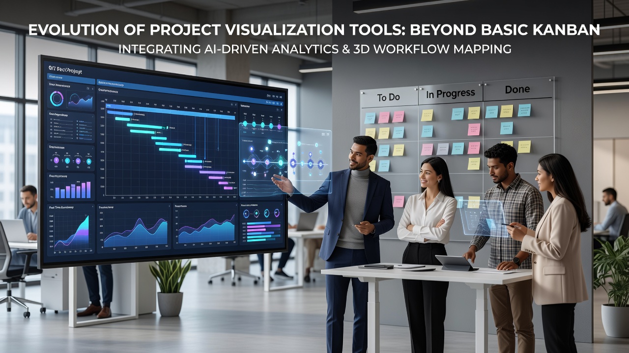
Academic research published in journals from Canadian universities examined how these layered interfaces affected decision speed, and findings indicated that participants who used multi-view systems completed planning exercises faster than those limited to single-board formats.
Role of Automation and Predictive Layers
Automation entered visualization tools through algorithms that suggested card movements based on historical cycle times, and these features appeared in major platforms around 2024; the result allowed teams to maintain visual accuracy without constant manual updates while still preserving human oversight for exceptions.
By October 2026 several enterprise solutions had incorporated predictive overlays that projected completion dates based on current throughput rates, and these projections updated dynamically as new tasks entered the system; government technology adoption reports from Australia documented increased uptake of such features in public sector projects where budget forecasting depended on accurate visual timelines.
Dependency graphs became another standard addition, rendering connections between tasks as nodes and lines that could be filtered by criticality or owner; this replaced earlier text-based lists and enabled quicker identification of critical paths that basic Kanban columns had left implicit.
Cross-Platform Data Sharing and Standardization
Integration with external data sources expanded visualization possibilities when tools began pulling live metrics from version control systems or customer support platforms, and the combined displays let stakeholders see both internal progress and external signals in unified views; industry organizations such as the Project Management Institute have published frameworks that encourage consistent data standards to support these connections across different vendor ecosystems.
Users who worked across multiple departments often discovered that standardized visual templates reduced onboarding time because new members recognized familiar patterns regardless of the underlying tool.
Conclusion
The progression from basic Kanban boards to layered visualization environments reflects consistent demand for tools that handle complexity without sacrificing clarity, and ongoing development continues to focus on seamless integration of time, resource, and predictive elements within single coherent interfaces.